AI for Comparing Stock Performance on Charts: Smarter Visual Analysis for Investors
In today’s data-driven markets, investors need more than just price charts. They need context—how one stock performs relative to others, how a sector trends against a benchmark, and what’s truly outperforming.
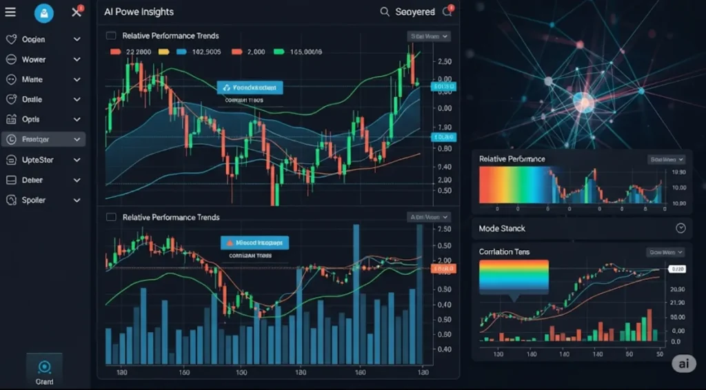
That’s where AI for comparing stock performance comes in. By using artificial intelligence to analyze, normalize, and visualize stock performance across multiple assets, timeframes, and sectors, investors gain a powerful edge. This approach goes beyond basic chart overlays or static comparisons—it uncovers hidden trends, rankings, and divergence patterns in real time.
In this article, you’ll discover:
Why comparing stock performance is essential
How AI makes visual comparisons smarter
Tools and platforms using this technology
Use cases for traders and long-term investors
How to implement AI-based comparison strategies today

📈 Why Compare Stock Performance?
Comparing stock performance is vital because price alone is misleading. A stock may rise 10%, but if the market rises 15%, it’s actually underperforming.
Key Goals of Comparison:
Identify relative strength
Spot sector rotation
Rank assets by risk-adjusted returns
Compare stocks vs benchmarks or ETFs
Time entries based on outperformance patterns
🤖 How AI Enhances Stock Performance Comparison
Traditional comparisons involve:
Overlaying multiple charts
Calculating % changes manually
Visual clutter when tracking more than 2–3 stocks
AI for comparing stock performance streamlines this by:
Normalizing data
Auto-visualizing comparisons
Detecting patterns and correlations
Identifying consistent outperformers
Updating insights in real-time
Let’s break down how it works.
🔍 1. Normalized Performance Comparison
AI standardizes each stock’s price movement to:
Base = 100 (or 0%)
Compare multiple assets over the same timeframe
Adjust for volatility, splits, dividends
Example:
AI plots Apple, Microsoft, and Google since Jan 1. Each line starts at 0% and shows cumulative return. This cleanly shows which stock is outperforming.
🔄 2. Dynamic Correlation Tracking
AI tracks how closely each stock moves with:
The index (SPY, QQQ, etc.)
Other stocks in the same sector
Safe-haven assets (e.g., gold, USD)
Using rolling correlation windows (e.g., 30 days), AI can show:
When two stocks diverge
When correlations break down
When one asset is a better hedge
🧠 3. Pattern Recognition: Outperformance Signals
AI is trained to recognize:
Relative strength breakouts
Leadership changes in a sector
Early stages of rotation
Anomalies where a stock decouples from peers
This allows traders to catch trends before they appear obvious on traditional charts.
📊 4. Heatmaps and Leaderboards
AI platforms generate:
Heatmaps showing 1-day to 1-year performance
Rankings of stocks by volatility-adjusted returns
Sector-relative scores (e.g., TSLA vs other auto stocks)
These tools let investors quickly:
Compare dozens of stocks
Focus only on leaders and laggards
Make data-driven decisions without guesswork
🔁 5. Multi-Timeframe Analysis
AI compares stock performance across:
Intraday
Daily
Weekly
Monthly
It identifies which timeframe the stock is outperforming in and whether it’s sustained or temporary.
Example:
“NVDA outperformed peers on the 1-week and 1-month charts, but shows weakness intraday—suggest caution for short-term trades.”
📌 Key Metrics AI Uses for Stock Comparison
| Metric | Description |
|---|---|
| Cumulative % Change | Total return over a timeframe |
| Sharpe Ratio | Risk-adjusted performance |
| Beta | Volatility vs market |
| Rolling Correlation | Relationship with benchmark |
| Drawdown | Max loss from peak |
| RSI divergence between assets | Momentum comparison |
| Relative Volume (RVOL) | Strength of conviction |
AI uses these to rank and visualize stocks for optimal decision-making.
🛠️ Best AI Tools for Comparing Stock Performance
| Tool | Features | Free? |
|---|---|---|
| TradingView (w/ AI scripts) | Compare charts, ratios, and overlay AI indicators | ✅ |
| Finbox / Koyfin | AI-generated fundamental + performance visualizations | ✅ (limited) |
| TrendSpider | AI smart charts and performance heatmaps | ❌ |
| QuantConnect | Custom AI comparison bots in Python | ✅ |
| Screener.co + AI Plugins | Fundamental + technical relative comparison | ✅ |
💡 Use Cases for AI Stock Performance Comparison
📈 1. Swing Trading Relative Strength
Use AI to:
Identify stocks with strongest weekly momentum
Compare to sector ETFs
Confirm with volume and sentiment AI
→ Focus only on market leaders
📉 2. Avoiding Underperformers
AI detects:
Stocks consistently lagging their sector
Assets diverging negatively from index
→ Exit or avoid holding dead weight
🔄 3. Sector Rotation Timing
AI finds:
When capital rotates from tech to energy
Which sectors are gaining relative strength
→ Rebalance portfolio ahead of the curve
💼 4. ETF vs Individual Stock Comparison
Compare:
A stock vs its ETF
AI highlights periods where the stock outperforms/underperforms
→ Decide whether to invest in the ETF or specific equity
📊 5. Multi-Asset Class Performance Visualization
Compare:
Stocks vs Gold, Bonds, Crypto
AI overlays risk-adjusted metrics
→ Allocate based on asset strength during inflation, recession, etc.
📉 Example: AI in Action
Scenario:
You want to invest in U.S. semiconductor stocks.
AI scans SMH ETF components and finds:
| Stock | 1M Return | 1M Sharpe | Rank |
|---|---|---|---|
| NVDA | +22% | 2.1 | #1 |
| AMD | +14% | 1.4 | #2 |
| INTC | +4% | 0.5 | #6 |
AI plots normalized performance chart and recommends:
→ Focus on NVDA and AMD
→ Avoid INTC (underperforming)
🧠 Why AI > Manual Chart Comparison
| Feature | Manual | AI-Based |
|---|---|---|
| 2–3 stock limit | ✅ | ❌ |
| Custom weighting | ❌ | ✅ |
| Dynamic updates | ❌ | ✅ |
| Pattern learning | ❌ | ✅ |
| Statistical metrics | Manual | Auto-generated |
| Correlation graphs | Limited | Advanced & interactive |
🔗 Related Reads You Might Like:


Pingback: Best Free AI Charting Tools for Cryptocurrencies: Smarter Analysis Without Paying a Dime - Trade Pluse Ai